mirror of
https://github.com/morpheusthewhite/spicetify-themes.git
synced 2024-11-22 10:52:48 +01:00
Personally I think it looks nicer with the padding of the input box being reduced, (text is closer to the left of the input box now), [change on line 275]. However, there is a vector in the input box which has to be removed so that the letters typed by the user aren't covered by it, [change on lines 265-269]. |
||
|---|---|---|
| .. | ||
| bladerunner.png | ||
| cherry.png | ||
| color.ini | ||
| coral.png | ||
| deep.png | ||
| deeper.png | ||
| dracula.png | ||
| elementary.png | ||
| futura.png | ||
| nord.png | ||
| psycho.png | ||
| README.md | ||
| ultrablack.png | ||
| user.css | ||
| wealthy.png | ||
Sleek
BladeRunner
Cherry
Coral
Deep
Deeper
Elementary
Futura
Nord
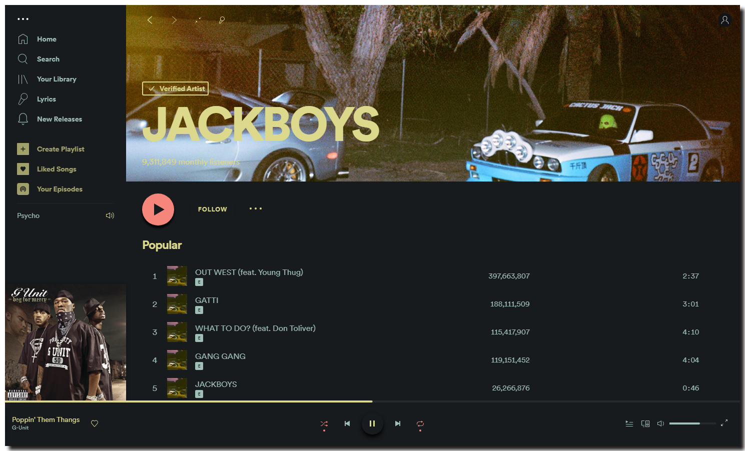
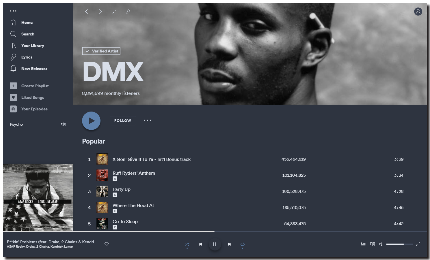
Psycho
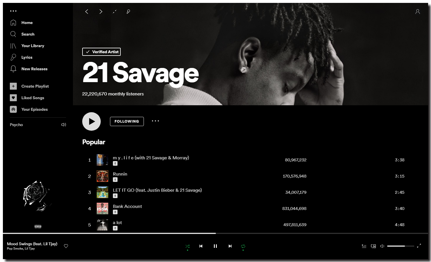
UltraBlack
Wealthy
Dracula
Info
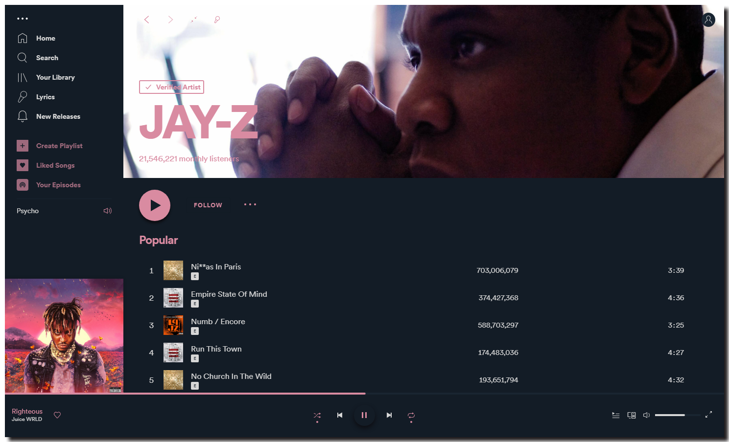
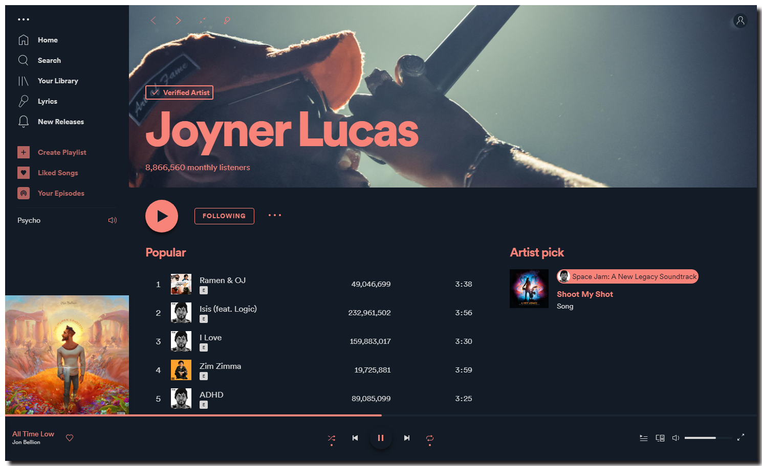
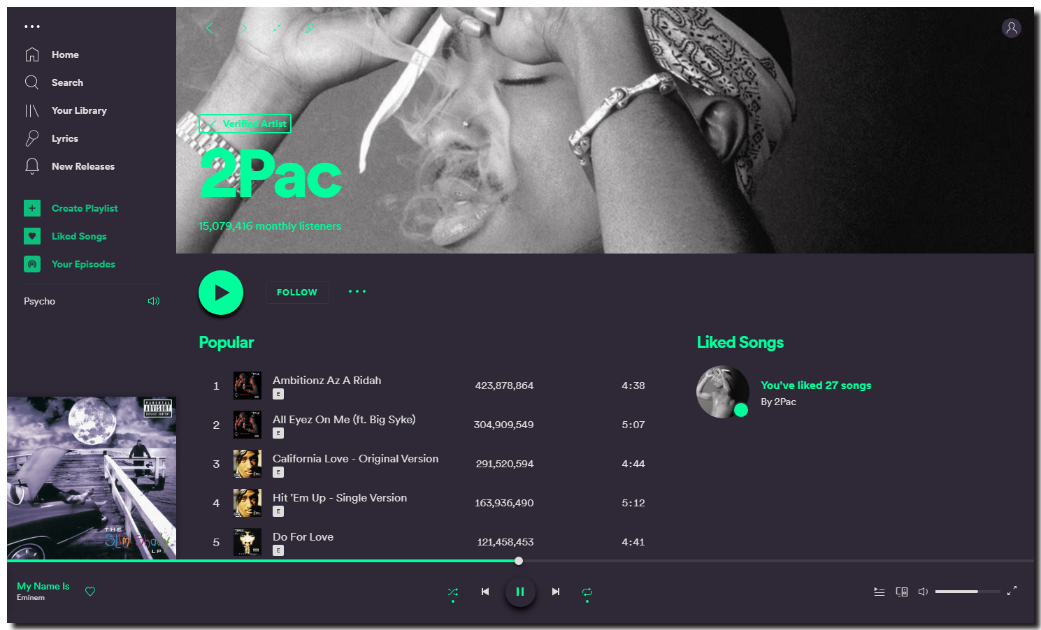
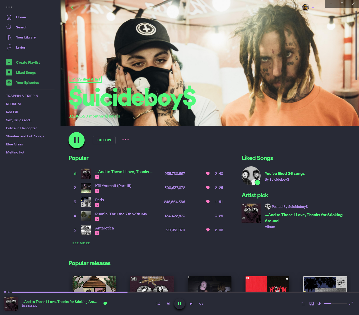
A simple, 'sleek' theme that builds upon the basic Spotify UI to create a more stylised experience. Also removes all annoyances from free version, including banner advertisements and upgrade buttons.
Created by @harbassan
Changing Color Schemes
Change the scheme with these commands:
spicetify config color_scheme <scheme name>
spicetify apply
